British Wireless for the Blind Fund
A charity built around accessibility, with a website that finally matched it.
At a glance
improvement in search visbility, making it easier for people living with sight loss to find the support they need.
increase in meaningful engagement, with more visitors exploring devices and support available to them.
of visitors now actively engaging with content, connecting more people with life-changing audio technology.
The challenge
British Wireless for the Blind Fund (BWBF) supports people living with sight loss by providing free, adapted audio equipment - giving people access to information and entertainment that would otherwise be out of reach.
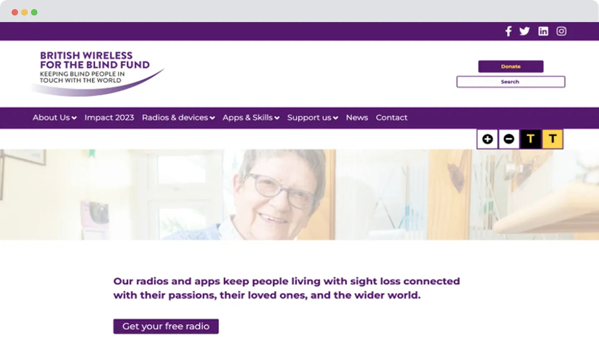
The charity's old website worked against that mission rather than for it. Content wasn't reliably compatible with screen readers, navigation was confusing, and accessibility compliance was inconsistent - meaning some of the very people BWBF exists to serve struggled to use the site at all. It also undersold BWBF's story to supporters, making it harder to inspire the high-value partners, trusts, and corporates the charity depends on.
BWBF needed a website that blind and partially sighted people could trust and use with genuine confidence, alongside a donor journey that could turn that trust into support - bringing the human impact of the charity's work to life in one place, rather than leaving it buried behind product detail and technical language.
Before
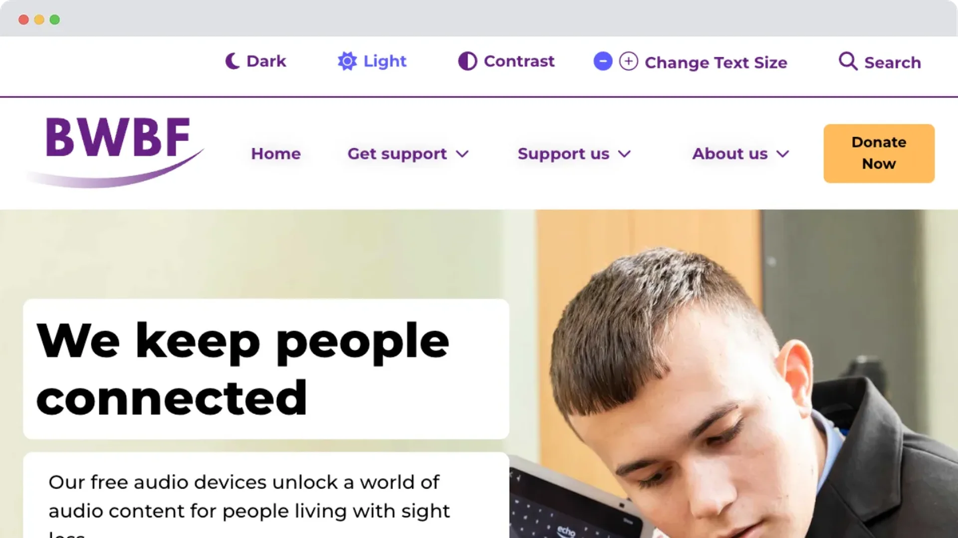
After
The solution
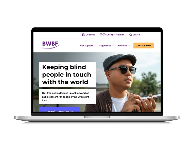
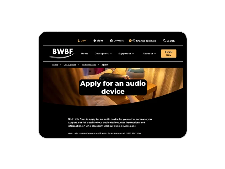
We worked in collaboration with Access by Audit, specialists in accessibility compliance, to build a site with inclusivity at its foundation rather than layered on afterwards. The result meets WCAG 2.1 AA compliance in full, with navigation and content structure user-tested specifically for screen readers and keyboard navigation - not just built to a technical standard, but tested against how people actually use assistive technology.
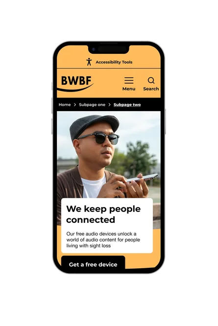
The site offers three distinct visual modes - light, dark, and high-contrast - alongside adjustable font sizing, so people with a wide range of visual and cognitive needs can choose what actually works for them rather than living with a single fixed design. Every component was tested for clarity and legibility before launch, validated by real users with sight loss rather than assumptions about what "accessible" should look like.
The site's storytelling shifted too - away from products and specifications, and toward the people BWBF exists to support. Photography, tone of voice, and content structure were rebuilt around lived experience, so a supporter encounters real impact rather than a catalogue of equipment.
The donation journey was reworked alongside all of this - simplified, made more inclusive, and brought in line with the same accessibility standards as the rest of the site, so raising support is as frictionless as finding help.
The impact
For the people BWBF exists to serve, being found matters as much as being helpful once they arrive - and the site is now doing both. A 138% improvement in search visibility means more people living with sight loss are actually reaching BWBF in the first place, at the moment they're looking for support rather than after a difficult search.
Once there, people are staying and engaging rather than bouncing off a confusing experience. Meaningful engagement rose 20%, and 65% of visitors are now actively exploring the site's content - exploring the devices and support on offer rather than leaving before they've found what they came for. Early feedback has echoed that shift directly, with visitors describing the site as clear, simple, and easy to navigate.
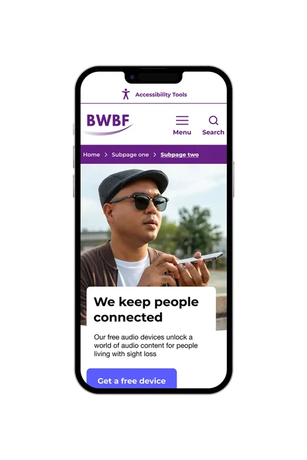
None of this is being treated as finished. BWBF and Giant Digital continue to work together through regular audits and user feedback, with improvements to navigation, contrast, and mobile usability already introduced since launch - accessibility treated as something to keep earning, not a standard met once and left alone.

This project has been about harnessing technical expertise to deliver on our values and vision for our users. We are delighted that our new website is compliant with key accessibility guidance and delivering an experience that puts the needs of people living with sight loss first. But launching our new website is the beginning, not the end of this journey. By listening to people living with sight loss, we will ensure our website thrives as a place where everyone feels welcome, inspired and able to access our life-changing support.
Jenny Cameron, Head of Communications, Marketing and Income at British Wireless for the Blind Fund






Make sure everyone can find what they need
Let's build a platform that's accessible from the ground up, not patched together afterwards.