Affinity Trust
Making it easier for people to find the support they need.

At a glance
more people reaching out for support through the main help form
more people using the help button to get support
increase in event registrations
The challenge
Affinity Trust is a leading social care provider, supporting people with learning disabilities, autism, and other assessed needs to live active, fulfilling lives across England and Scotland. Since 1991, the charity has steadily grown its services - but its website hadn't kept pace.
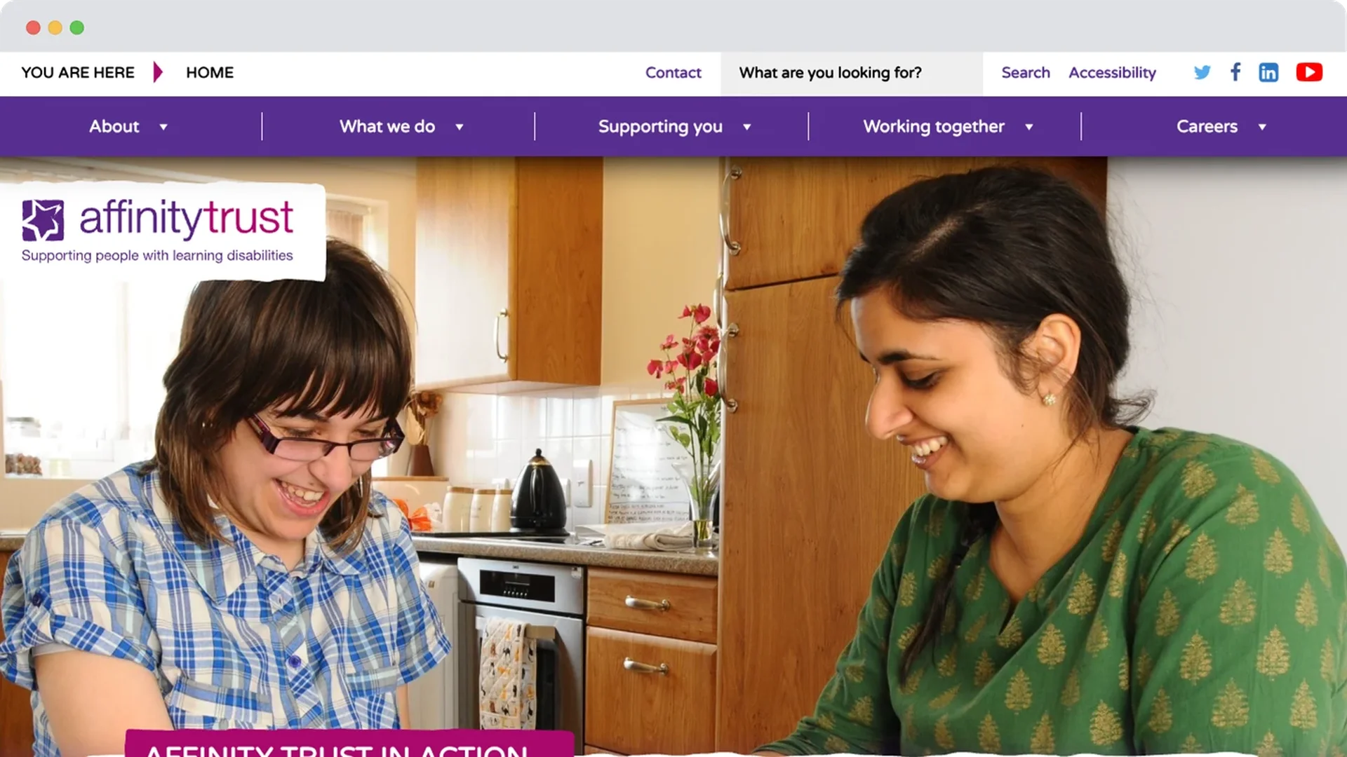
Most visitors arrived on mobile, yet the site wasn't built for it. Navigation was genuinely difficult to use, with some pages buried up to eleven levels deep - a structure that made sense internally, perhaps, but left visitors unable to find what they needed. Donating wasn't straightforward either: no Apple Pay or Google Pay, and forms long enough that people were dropping off before finishing, including at key moments like event sign-up.
The project also landed alongside a brand refresh that hadn't yet been finalised, meaning the new website would need to help shape how that brand actually worked online, not just carry it once it was ready. For an organisation whose whole purpose is making support accessible, the website itself had become a barrier rather than a way in.
Before
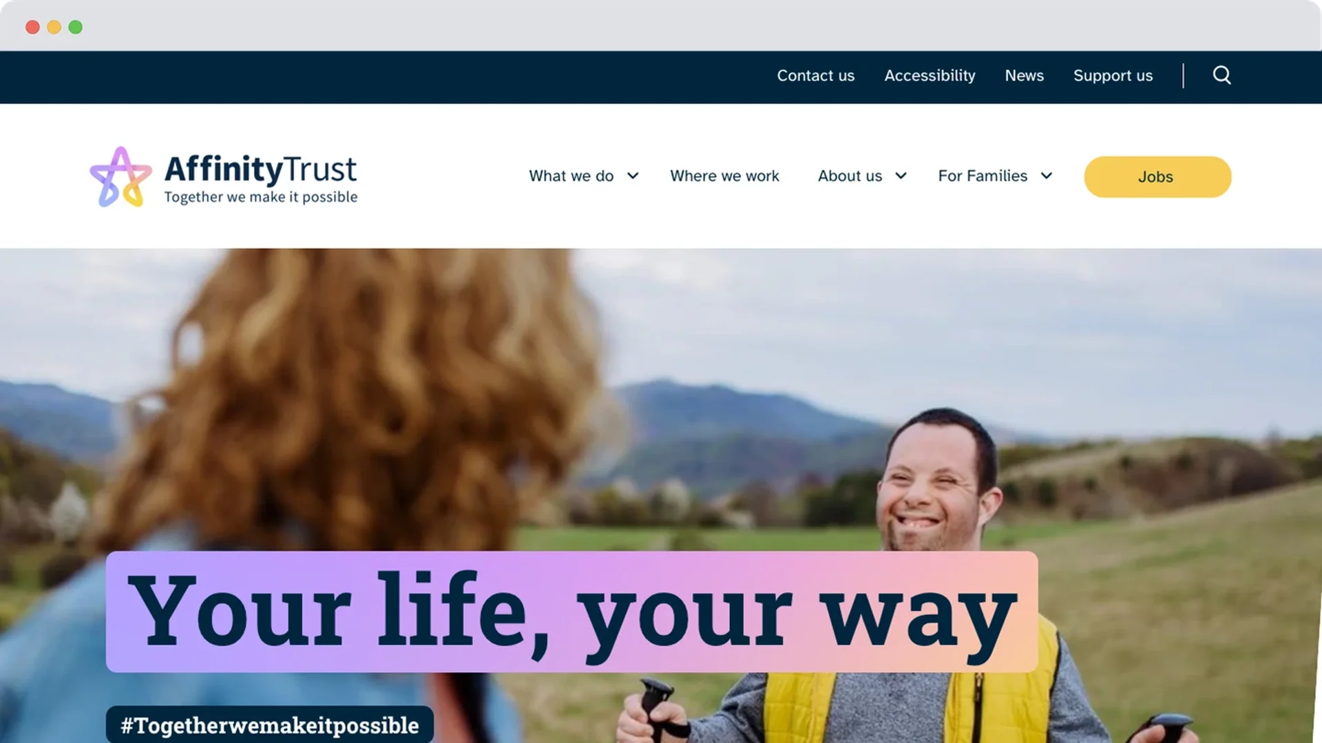
After
The solution
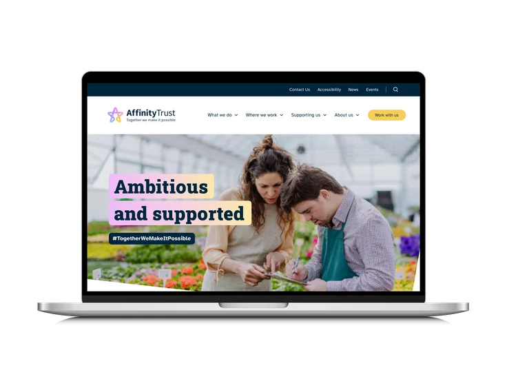
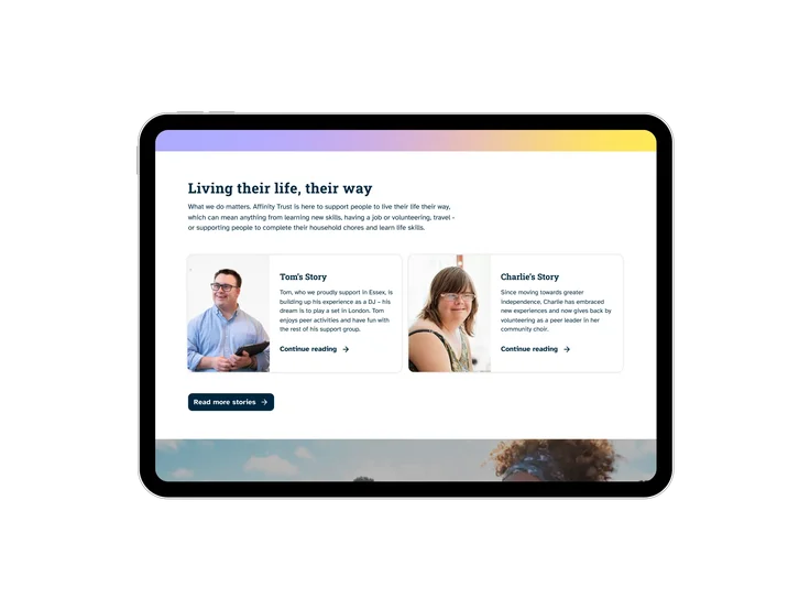
With Affinity Trust's rebrand still taking shape, we worked alongside the branding agency to help define how the new identity would actually function digitally, informing decisions the brand itself was still making, rather than simply applying a finished style guide once it arrived. That collaboration meant the brand and the website could develop together, so the identity translated into the digital experience cohesively, and stayed accessible by design rather than needing retrofitting afterwards.
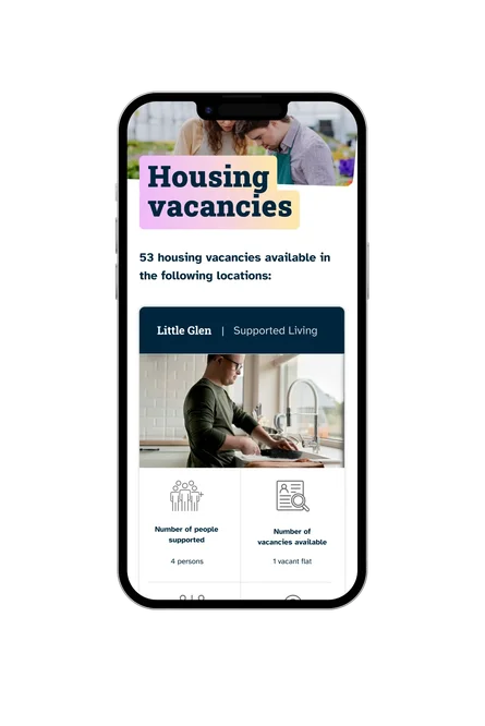
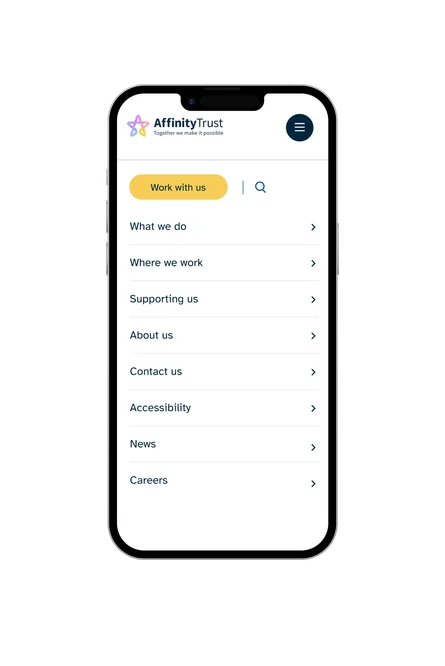
We rebuilt the website mobile-first, since that's where most visitors already were, and simplified the information architecture so pages that had been buried became genuinely easy to reach. The redesign also meets WCAG accessibility standards throughout, making sure the site works for the full range of people Affinity Trust supports, not just the majority.
The donation journey moved onto Giant Giving, our own donation platform - adding Apple Pay and Google Pay for quick mobile giving, and cutting the flow down to what it actually needed, with impact-driven messaging at each step to show people exactly what their support achieves.
Event sign-ups and support forms were redesigned around the same principle: fewer steps, clearer calls to action, and a more direct route to the help someone came looking for in the first place.
The impact
More people are getting the support they came looking for. 60% more people reached out through the main help form, and 13% more used the help button directly - two different routes to the same outcome: someone who needed support found a way to ask for it, when the old site would likely have lost them first.
Event registrations rose 20% too, meaning more people are choosing to get involved beyond a single moment of need, building the kind of ongoing relationship with Affinity Trust that a support-seeking visit alone doesn't create.
None of this came from one big change. It's the combined effect of clearer navigation, real accessibility, and a website finally built around what people needed to do.

The team at Giant are very much an expansion of my team. They genuinely care, want to work with you and deliver a great product for you. The level of expertise is impressive, and we've got a website that works hard for the organisation and is an outstanding 'shop window'. Whether they are interpreting your vision or advising that something else might work better, there's a solid foundation of trust, and that's vital. Our tagline at Affinity Trust is 'together we make it possible' which also sums up the relationship we have with Giant.
Jill Spurr, Head of Communications and Marketing at Affinity Trust





Help shouldn't be hard to find
Let's build something that helps more people find the support they came for.